When most people think about landing pages and trying to perfect them, people think about colors and pictures and animation or other elements that are going to draw attention.
These things are important but it’s not the only thing that’s going to help draw attention and generate leads.
There’s more to landing pages than just the looks.
What Is A Landing Page?
A landing page is a webpage that appears when a user clicks on a search engine result or advertisement. The landing page typically displays content related to the advertisement or search result.
A landing page is a web page that is designed to attract visitors to a website by providing a specific product or service. Landing pages are often used in conjunction with search engine optimization, where the goal is to rank high in search engine results pages.
How To Generate Leads With A Landing Page?
The landing page is where it all comes together. This is where all the action happens.
At this point, you are probably wondering, “What is a perfect landing page formula?”
However, we need to get a few things out of the way, so we are all on the same page:
- The landing page is not your normal home page.
- The page is separate from your company site.
- The landing page should not have navigation, in order to avoid distraction.
- The landing page has ONLY 1 goal.
- The more landing pages = more results
- The same landing page doesn’t work for everyone.
- Landing pages get outdated as consumers change.
- The CTA must be displayed multiple times
- Avoid company philosophy and extraneous information
- Only collect the information that you need (as an example, get the zip code and skip the city and state).
- Make sure that you state the problem and how the CTA is solving the issue.
- Test several headlines
- Make sure that the landing page is mobile optimized.
- Skip the animation and exploding graphics. This is not the fourth grade.
- Make sure that the landing page loads in UNDER TWO SECONDS.
- Don’t forget the testimonial/social proof.
What Make A Landing Page Perfect For Lead Generation?

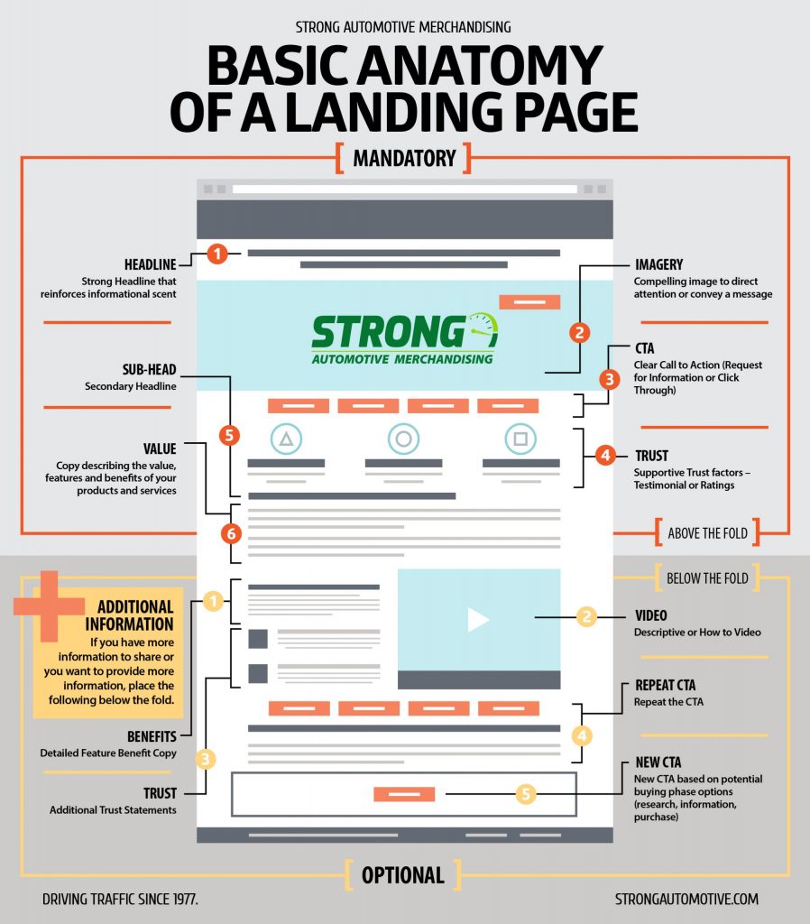
Headline
This is what we call the attention grabber. This will get people to read the rest of your landing page. Consider using numbers and instant gratification.
An example is: Every website owner needs this tool to boost their sales.
Sub-Headline
This is optional. However, it could actually help. Use sub-headlines, when they can complement your headline.
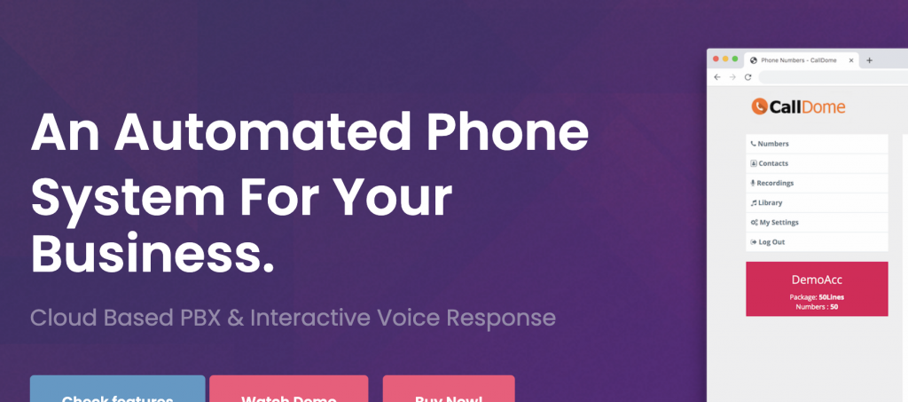
An example is: I am selling a software product that will help website visitors send voicemail directly via the website.
My headline could be: “Every website owner needs this tool to boost their sales.”
Under it in a smaller font, I could put: “Cloud Based Voicemail Platform”

I must actually prove my headline. That can be done through testimonials, screenshots, video proofs, etc. However, the sub-headline lets your visitor know EXACTLY what you are offering.
Video/Image
You need to compliment your landing page with a relevant image or video. Many marketers make the mistake of putting in images that have nothing to do with the offer.
PRO TIP: When in doubt about the image, use images of women and children. This is because both men and women love to look at women’s pictures. Make sure that the image is not obscene unless that is your target (dating lead generation) If you are selling insurance or any security product, be sure to include pictures of families or children. This triggers consumers to think about their own families. If you are adding a video, it should be under five minutes long. This is because people will generally not pay attention after that. The video must be creative so that it holds the consumer’s attention.
Call to Action
It is important to remember the rule of putting CTA on the FIRST fold of the website, flyer, etc. You should also put it at the end of the offer because you want them to take an action after they have finished reading your offer.
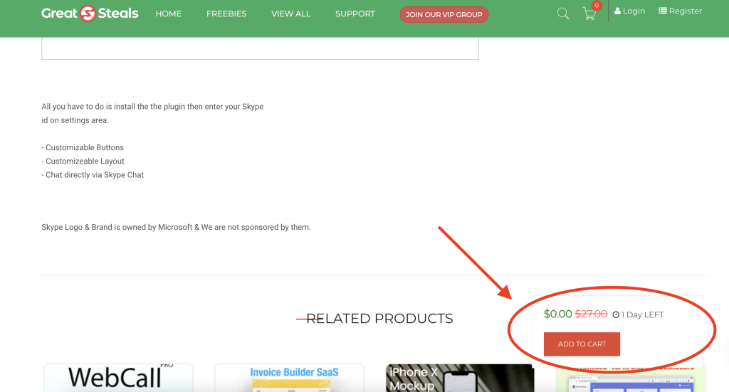
PRO TIP: On our eCommerce website, we add “Add To Cart” as a floating button. Therefore, wherever they are on the screen. the button is right there.

Value Selling
On your landing page, you should make it clear to them exactly what they are receiving in exchange for their information or money.
You must give them what you promised. That is as simple as it gets. If you promise your visitors access to 50 video modules, there had better be 51. It’s always better to over-deliver than under-deliver.
You should always focus on VALUE selling. Many companies focus on FEATURE selling. It doesn’t work! Sell on the VALUE of having that feature.
The value could be saving time, saving money, adding more revenue, or a shortcut.
Second CTA
The second CTA should be at the bottom of the page or on the backside of the flyer, once they have actually read your offer.
You need to tell your consumer what you want them to do and then again remind them what they need to be doing.
Trust factors
No one wants to work with people who are not credible and they don’t want to enter information at a random site they found.
Therefore, how do you increase the trust factor?
- Install a SSL certificate.
- Add Privacy and Terms of Service links at the bottom of the page (use very small fonts, since you don’t want this to cause distractions).
- Use badges, such as BBB. Testimonials
- Use toll free 1-800 or 1-888 numbers on a Flyer or put them at bottom of site.
- Add “live chat,” “offline messaging” or a support link.
- Offer refund policy, if this is a sales landing page
The goal is to reassure them that they are in good hands.
Conclusion
Having a landing page that generates leads is not all about the looks, color, contrast, animation, or more.
There are other elements that make your landing page perfect to generate leads.

